Nowadays with the growing awareness of internet surfers, they now getting cleverer than before. Since the AdSense nowadays deliver not so accurate advertisement, the internet surfers in turn tend to avoid the advertisement links. But dont worry...nuthing is imposible
First methode: Tricky ads text,title and links.
Study the ScreenGrab below: I grab this from a Photoshop tutorial website
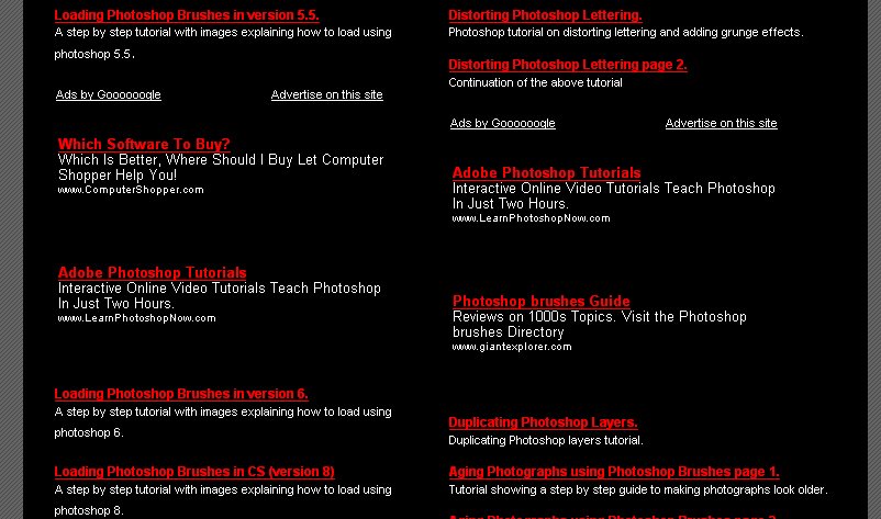
The border and the background has been blackened so that it suit to the backgorund of the page.The text and links are also hard to distinguish because of the white color they possesed. Which is the advertisement links and which is the link from the website itself.The title has red in color, same like the titles that are from the website.
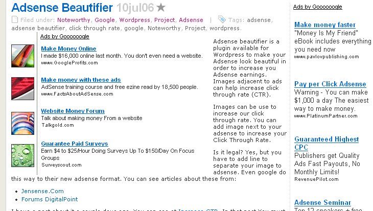
Second methode: Small thumbnail beside medium rectangle Ads
Study the position of the AdSense and the 4 small thumbnail beside it. Did it suit each other?
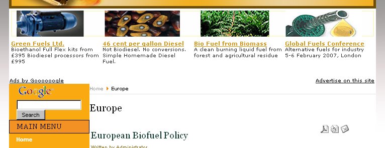
Third methode: A row of 4 pictures above a leaderboard Ads
Study the position of the AdSense and the 4 small pictures above it. Did it like the belong each other.
For Wordpress user, get your plugins AdSense Beautifier here.
And for your soup of the adsense soul...here is the bunch tips and tricks on how to improve your adsense revenue...click here
Tags:

No comments:
Post a Comment